World Energy Consumption
This will be a small project to look at world energy consumption and how it has changed over time. The primary focus on this dataset will be data wrangling and visualization.
You can see the corresponding Jupyter notebook on GitHub.
Data Set
Data is from the World Energy Consumption dataset on Kaggle. This data set is maintained by Our World in Data. The data set contains 122 columns and 17,432 rows. Each row is a specific year for a specific country. Countries are repeated on multiple rows with varying years.
There is a data dictionary on the Kaggle site I will not copy here for length, but the columns break down different energy types (coal, nuclear, wind, etc.) in various ways (share of consumption, annual percentage change, per capita consumption, etc. ). There is also some basic country information such as population and GDP.
The date range begins in 1900 and ends in 2019. There are 216 unique country codes included.
Find the number of NaN values by Year
By exploring the data, we quickly see that there are a lot of NaN values. This is because of the large time range covered in the data set. This will impact our analysis, so now let’s take a look at the number of NaN values by year and column. This will start to give us an idea of what data we can use and what data we should be careful with.
We use energy.groupby(['year']).apply(lambda x: x.isnull().sum()) to count and sum the number of NaN values for each year. We can then quickly visualize each column over time to see how the number of NaN values changes.
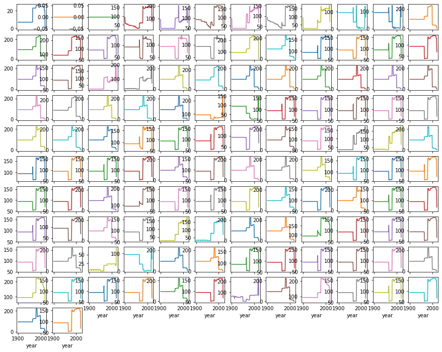
We did not add column labels to this plot because it gets too busy, but this gives us an idea of missing values. Around 100 seems to be a common number of missing values. We were hoping to see that as the data got closer to the current year, the number of missing values decreased. However, that is not the case. Quite a few columns increase suddenly to over 150 missing values (out of the about 216 available values).
Changes in Energy types
Now that we understand that data set a little better, let’s start to get into some more details. In particular, let’s start by looking at how energy usage by type has changed for different countries. We’re going to be curious about how these have changed over the years, so we really want the percentage of total energy consumption for different types.
Columns that contain the share of energy from various types end in columns with share_energy. Let’s use this to identify all of these columns, which we do with
energy_share_cols = [col for col in energy.columns if 'share_energy' in col]
Let’s pull out a single country so we can look at this data closer to understand how we might use it. For simplicity, we will start with the USA. Let’s visualize all the columns with share_energy so we can get a better idea of what our data includes at this point.
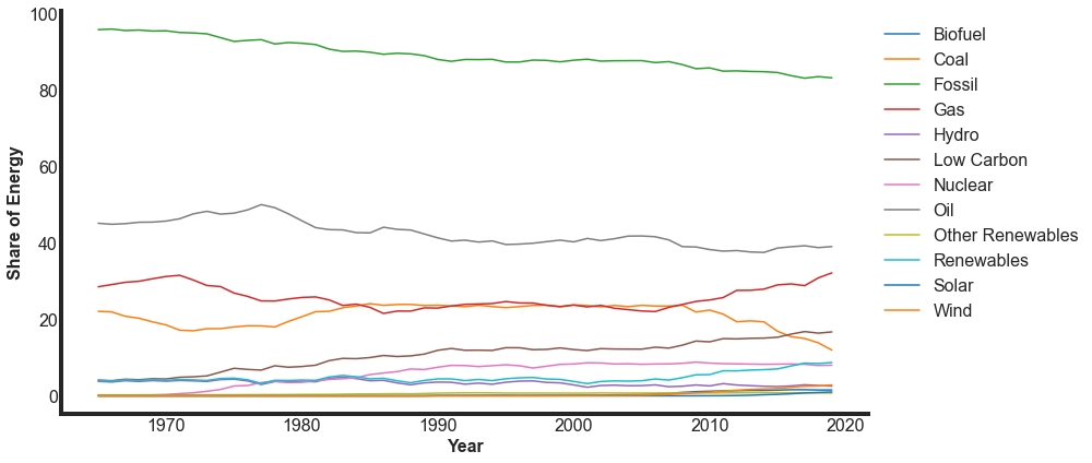
We first note that the earliest year of data for the US is about 1965. If this is a generally true date, this puts a limit on the date ranges we might look at.
These different columns contain some similar and overlapping information. We need to break these down to identify exactly how these columns relate to each other. It appears that some of these are sums of other columns. To do this, let’s pick a few years from this data set so we can actually look at some numbers.
We need to determine how these relate to each other. A few of these are combined categories. By comparing these categories, we determine that the following combinations are included here:
- Fossil: coal + gas + oil
- Renewable: biofuel + hydro + solar + wind
- Nuclear
We have confirmed how thes columns relate to each other. We are missing the low_carbon and other_renewables columns from our sum.
low_carbon is renewable energy (biofuel, hydro, solar, wind) and nuclear summed.
other_renewables is still a little unclear on the meaning. But we do not want to proceed without understanding this column. Some investigation leads us to understand that other_renewables is included in the sum of renweables = biofuel + hydro + solar + wind + other_renewables.
Visualizing changes in energy sources
Now that we have sorted out the energy shares for each country, let’s begin to take a look at how these values have changed over time. We will create a visualization that shows us how fossil, nuclear, and renewables have changed as percentages over the period we have data for.
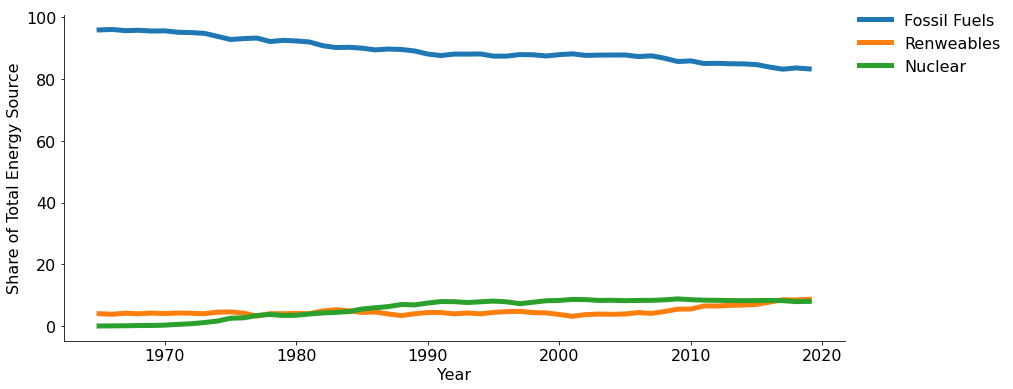
This is not particularly interesting at this point. The differences in these values are too large, and the changes too small, to quickly understand the story.
We need a better story to tell. Let’s consider some of the other infomration in our dataframe. Let’s look at including gdp, per_capita_electricity, or population.
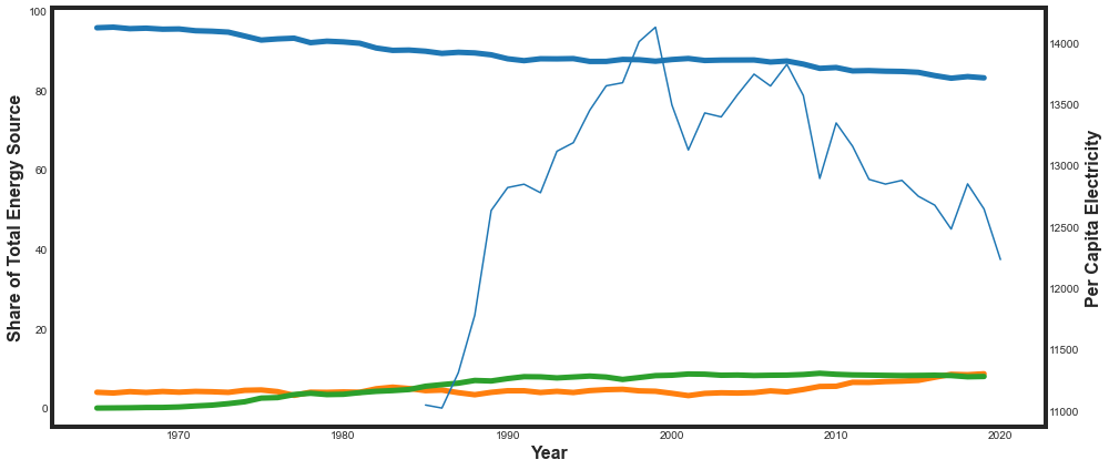
Similar to above, adding information to this plot does not tell an attractive story. It’s unclear what the take away is going to be. Instead of looking at percent shares, let’s try looking at percent changes over time.
Percent Changes Over Time
To look at percent changes over time, we’ll write a function called calculate_changes that calculates the changes we are interested in. This allows us to quickly iterate and calculate the information we are interested in.
Let’s calculate the change in a countries population, GDP, and ratio of energy sources between 1990 and 2015. We’ll create a new dataframe with this information.
def calculate_changes(df,country_code,first_year,last_year):
    '''
    Function to calculate the percent changes in the GDP, population, and share of renewable energy.

    INPUT:
        df: dataframe
        country_code: 3 letter ISO code for country of interest
        first_year: first year you want to include in the calculation
        last_year: last year (inclusive) you want to include in the calculation

    OUTPUT:
        gdp_change: percent change in GDP from first_year to last_year
        pop_change: percent change in population from first_year to last_year
        energy_change: percent change in the share of (nuclear + renewable) energy. A positive
                        value indicates the country is using more (nuclear + renewable) energy in
                        the last year compared to the first
    '''

    # create a temporary dataframe with only the country of interest
    country_df = df[df['iso_code'] == country_code]

    # we want to calculate the percent changes between the first year and the last year
    early_year = country_df[country_df['year'] == first_year]
    last_year = country_df[country_df['year'] == last_year]

    # we need to check if we have data for that year for that country
    # if not, we will return 0, 0, 0
    if early_year.shape[0] == 0:
        return(0,0,0)
    if last_year.shape[0] == 0:
        return(0,0,0)

    # now we are ready to calculate the percent changes
    gdp_change = (last_year.iloc[0]['gdp'] - early_year.iloc[0]['gdp']) / last_year.iloc[0]['gdp'] * 100
    pop_change = (last_year.iloc[0]['population'] - early_year.iloc[0]['population']) / last_year.iloc[0]['population'] * 100

    # the change in energy ratio is a little more complicated.
    # first we need to determine the ratio in both years of interest
    energy_ratio_early =  early_year.iloc[0]['nuclear_share_energy'] + early_year.iloc[0]['renewables_share_energy']
    energy_ratio_last = last_year.iloc[0]['nuclear_share_energy'] + last_year.iloc[0]['renewables_share_energy']
    energy_change = (energy_ratio_last - energy_ratio_early) / energy_ratio_last * 100

    if np.isnan(gdp_change):
        gdp_change = 0
    if np.isnan(pop_change):
        pop_change = 0
    if np.isnan(energy_change):
        energy_change = 0

    return(gdp_change, pop_change, energy_change)
Running our function on a few different countries randomly selected, we see that quite a few have missing values. This will impact how much data we have at the end, because if one of the years of interest is missing, we can’t calculate the change we want. We need to optimize the years that we choose. Let’s take a look at some variety of options to make this decision.
We can iterate through a variety of starting years, then sum the number of countries that have missing values. Any missing value for our three values of interest (population change, GDP change, or energy change) will disqualify that country from being used. We accomplish this with the following block of code, creating a dictionary where the keys are the starting years and the values are the number of missing countries.
first_years = [1970,1971,1972,1973,1974,1975,1976,1977,1978,1979,
               1980,1981,1982,1983,1984,1985,1986,1987,1988,1989,
               1990,1991,1992,1993,1994,1995,1996,1997,1998,1999,
               2000,2001,2002,2003,2004,2005,2006,2007,2008,2009,
               2010]
last_year = 2015

start_year_missing = {}

for y in first_years:
    year_test_df = pd.DataFrame(columns = ['country','pop_change','gdp_change','energy_change'])

    for country in country_list:
        gdp_change, pop_change, energy_change = calculate_changes(energy,country,y,last_year)
        new_row = {'country': country,
                  'pop_change': pop_change,
                  'gdp_change': gdp_change,
                  'energy_change': energy_change}
        year_test_df = year_test_df.append(new_row, ignore_index=True)

    missing = year_test_df[(year_test_df['pop_change'] == 0) |
                           (year_test_df['gdp_change'] == 0) |
                           (year_test_df['energy_change'] == 0)].count()
    start_year_missing[y] = missing['country']
And then we can plot this to see how it has changed over time.
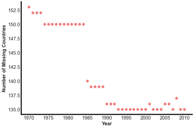
Through 1984 there are about 150 countries with missing values. This decreases to 140 in 1985, then over the next 25 years, it goes down to 136 missing values, then oscillates some. We want the biggest lever here to see the change over the longest period of time, so we will start with 1985 as our start date. This gives us 10 additional countries that were not included before then, but still gives us 30 years of data to work with.
This is quite a lot of missing countries. Of the ~215 included in the data set, we miss information on over 60% of them. This is not normally something we would want to use. Why are we missing so many of these values? What can that tell us about the methods of data collection used for this data set?
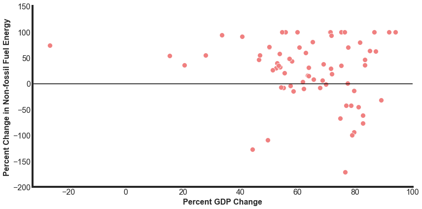
Now we are ready to look at how the percent change in non-fossil fuel energy relates to changes in population and GDP.
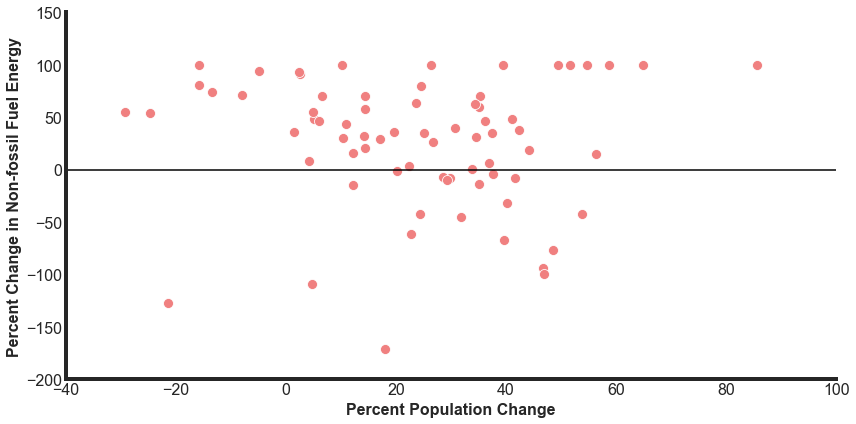
There are a number of significant outliers. Let’s take a look at the most extreme changes to having less non-fossil energy sources between 1985 and 2015.
- Trinidad and Tobago (TTO) has a -1233% decline in their share of non-fossil energies. TTO had a very small share of renewable energy (less than 0.1%), so this accentuates any changes.
- Algeria (DZA) went from a 0.6% share of renewable energy in 1985 to a 0.09% share in 2015.
- Bangladesh (BGD) went from a 4% share of renewable energy in 1985 to a 0.7% share in 2015.
There are also 9 countries that have a 100% change in non-fossil fuel usage. This indicates that these countries started with 0 non-fossil use but now have some usage, even if small.
Ukraine is an interesting country that had a GDP that has gotten smaller but has significantly increased it’s share of nuclear energy, leading to a 73% increase in non-fossil energies.
Next Steps
At this point, we are going to wrap up this project. If we continued to work on it, here are some ideas of directions we could take:
- We decided to limit the comparisons here to data that was included in the data set. Considering outside information would potentially provide more information to help us understand some of these changes that we have found. Some of the helpful information could be money spent on environmental innitiatives, primary modes of transportation, trade.
- Our final plots only included 74 of the 216 countries available in the dataset. We could take a closer look at some of these missing countries to see if we could calculate our desired fields based on information that has been included.
- Related, we could investigate why we are missing so many values. What can that tell us about the methods of data collection used for this data set?
- We could use the time series data included to make predictions for the future and how, globally or by country, energy consumption will look at specific years of interest related to climate change.