I-94 Traffic
Introduction
We will explore the traffic on westbound I-94 to investigate the causes of heavier and lighter traffic. We will use a dataset from the UCI Machine Learning Repo.
You can find the full Jupyter Notebook on GitHub here.
Goal
What are the indicators of heavy traffic on I-94?
Data Dictionary
holidayCategorical US National holidays plus regional holiday, Minnesota State FairtempNumeric Average temp in kelvinrain_1hNumeric Amount in mm of rain that occurred in the hoursnow_1hNumeric Amount in mm of snow that occurred in the hourclouds_allNumeric Percentage of cloud coverweather_mainCategorical Short textual description of the current weatherweather_descriptionCategorical Longer textual description of the current weatherdate_timeDateTime Hour of the data collected in local CST timetraffic_volumeNumeric Hourly I-94 ATR 301 reported westbound traffic volume
We first load the libraries and will be using Matplotlib and Seaborn for data visualization quite a bit for this project. We’ll call the dataset df.
Analyzing Traffic Volume
We first look at a histogram of the distribution of traffic volume. We can quickly generate this plot from the dataframe using
df['traffic_volume'].plot.hist(color='lightcoral')
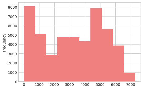
Traffic volume represents the hourly number of westbound cars on I-94. There are two peaks with bin centers of about 300 and 4800. The lower bin is probably middle of the night numbers and the higher bin is probably peak commuting time.
The above insight is confirmed when we use df['traffic_volume'].describe(), as we see that there is a fairly large standard deviation here. We will first start with exploring traffic volume by day and night.
Day Vs. Night
We will divide the dataset into two parts:
- Day hours: 7am to 7pm
- Night hours: 7pm to 7am
Picking the swithing times is somewhat arbitrary, but we can return and change this later if we want. We should keep in mind this decision. We need to transform the date_time column to a datetime object for easy analysis:
df['date_time'] = pd.to_datetime(df['date_time'])
then break the dataset into day and night dataframes using Boolean logic:
day = df[(df['date_time'].dt.hour >= 8) &
        (df['date_time'].dt.hour <= 19)]
and
night = df[(df['date_time'].dt.hour >= 20) |
          (df['date_time'].dt.hour < 7)]
Then we see how breaking apart the dataset has changed the traffic distributions
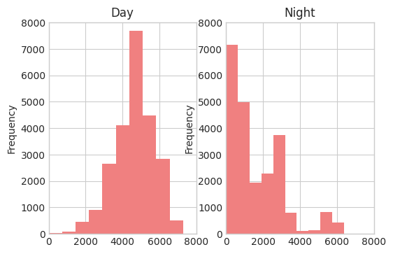
We see that the Day and Night distributions look very different. At night, more than 75% of the time the number of cars per hour is less than 3000. While during the day, it is rare to have fewer than 2000 cars per hour. The night data is almost bimodal, which also might be because of our choices of day and night switching.
In general, since we are looking for indicators of heavy traffic, for now, we will focus only on the day data.
Time Indicators
Another possible indicator of heavy traffic is time. We are going to look at how traffic volume varies by month, day of the week, and time of day. We will use df.groupby() to accomplish this quickly.
We start by grouping by month:
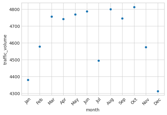
Overall, winter months had the lowest traffic volumes. July is an exception.
We then group by day of the week:
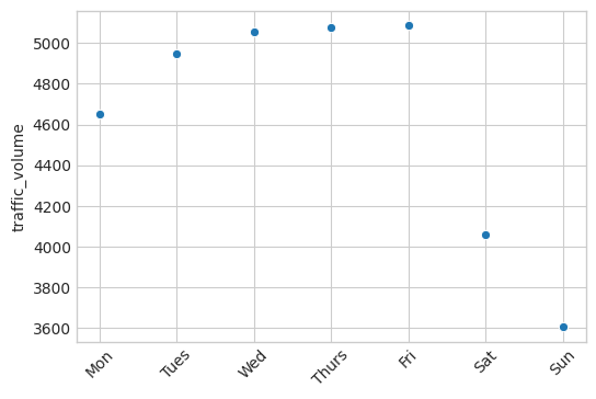
Saturday and Sunday are the lowest average traffic volumes. This is not surprising and confirms that most traffic is related to work commuting.
Finally, we will look at the time of day. Based on above, we will split the business days and weekends for our analysis.
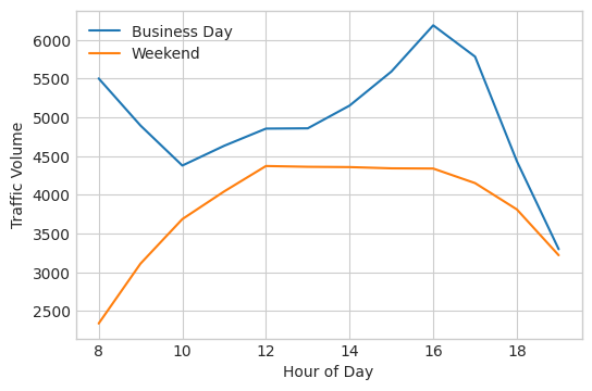
On business days, we see that most traffic occurs between 3 and 5 pm. There appears to be a peak around 8am we could also expand our focus on. On weekends, there is a wider range of peak values corresponding to 12 pm to 4 pm. The weekend values (as we noted earlier) are much smaller than business day values.
Weather Indicators
We will now look at weather indicators for heavy traffic. The dataset provides quite a few useful columns related to weather, so we will start by looking at their correlation values with traffic_volume.
| Correlation with Traffic Volume | |
|---|---|
| Temp | 0.133 |
| Rain | 0.005 |
| Snow | 0.005 |
| Clouds | -0.037 |
| Month | -0.012 |
| Day | -0.324 |
| Hour | 0.004 |
We can also visualize these easily with a heatmap.
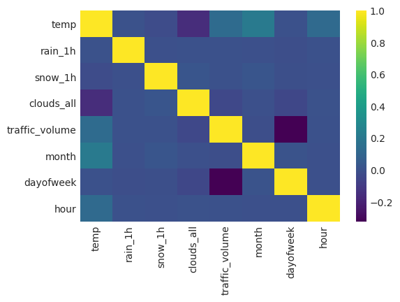
None of the numerical weather indicators are strong correlations with the traffic volume. We will move on to looking at the categorial weather-related columns
Weather Types
The categorial weather columns are weather_main and weather_description. The weather_main column contains fairly coarse weather types while the weather_description contains many more minute variations of weather types.
We create bar plots for both of these to quickly visualze the relationship between each weather type and traffic volume.
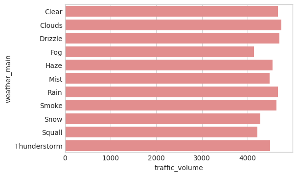
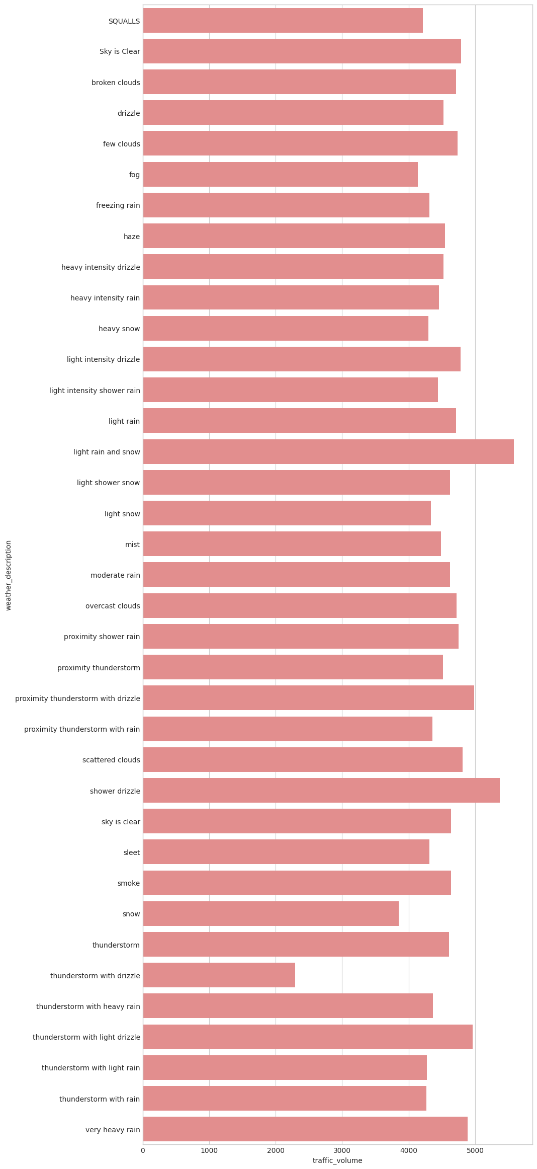
Light rain and snow, along with shower drizzle are the highest traffic volumes. The coarser weather grouping above does not clearly show a reliable indicator for traffic volume.
Wrap-Up
In this project, we explored the indicators of heavy traffic on I-94. We proved there is a strong time dependence on the month, day, and hour. This is a result of human patterns of work and play. The weather correlations were less strong indicators, but there light moisture appears to be the strongest. This is probably because heavy weather, like a blizzard, convinces most people to stay home while light weather does not.